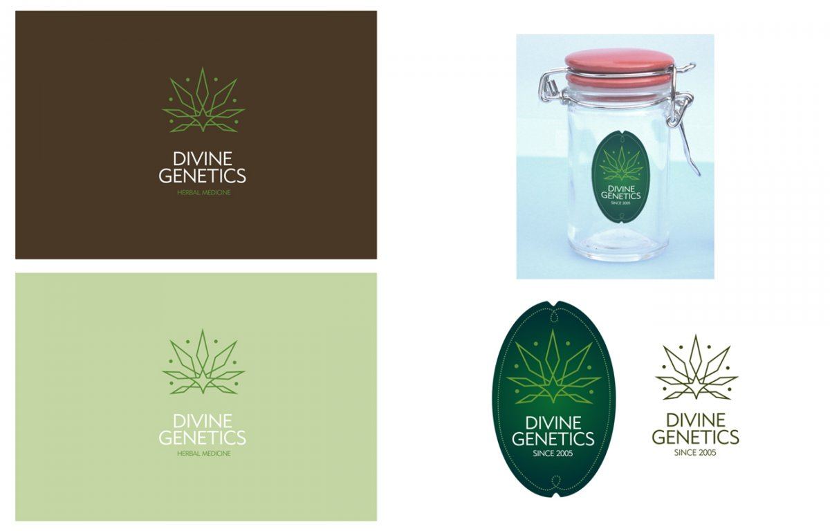
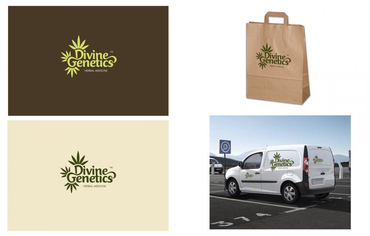
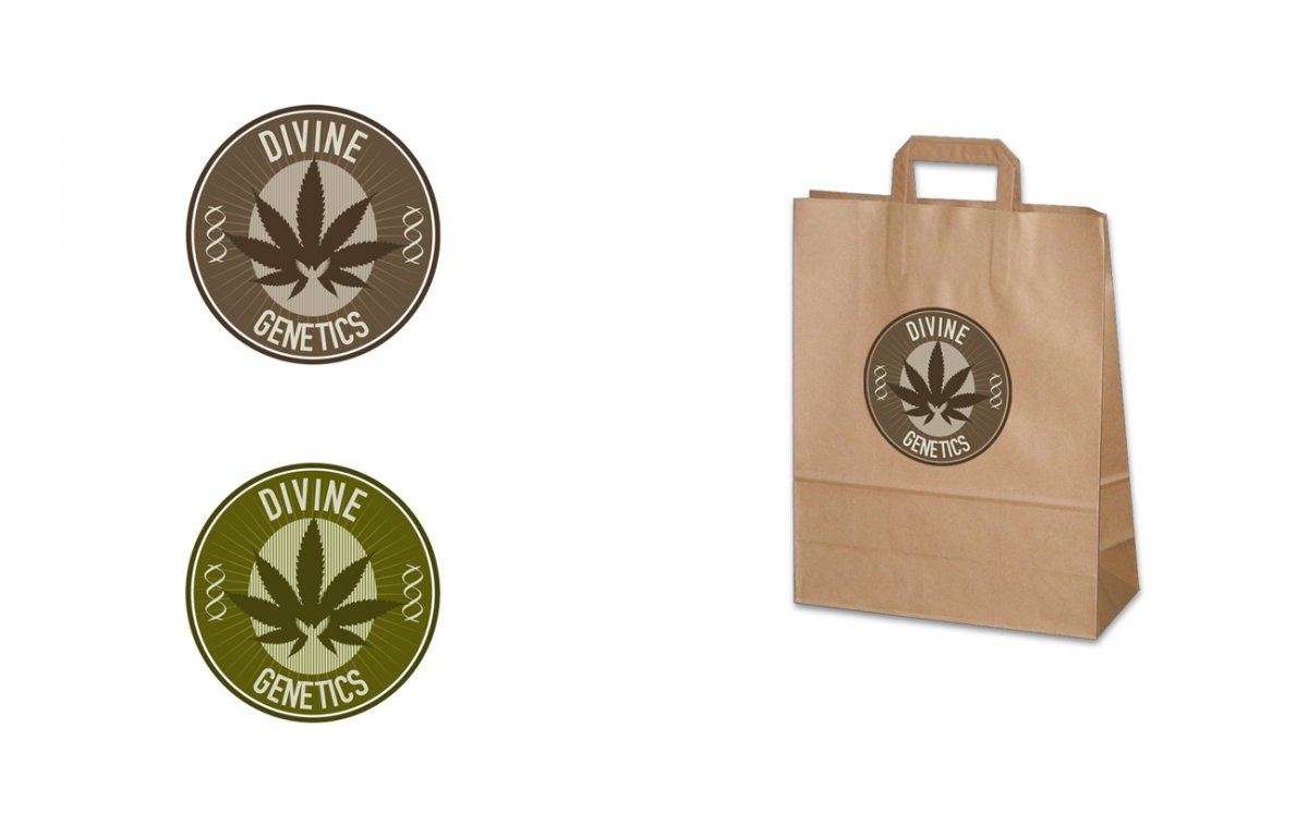
Logo design mockups

Status
Not open for further replies.

Divine Genetics

Supporter
273
28
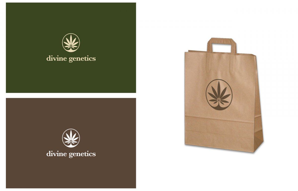
Just wanted to share some logo designs with you

#1 and #3 are my favs :) (click the images to zoom)

Logo design mockups


Logo design mockups 2


Logo design mockups 3


Logo design mockups 4
 
G

Genius Genetics

325
0
i agree with you logic #1 & #3 look smart but its #3 i like the most looks real neat bro :)

#4 looks kinder old, if you know wot i mean.
 
jah_hoover

jah_hoover

984
28
3 looks bang on Logic, its got that funky look and is more attractive to the eyes bro.
 
vaporedout

vaporedout

1,362
163
#1 has that clean look to it though. kinda reminds me of recycling, or earthy.
 
4

420king-MASSES

1,504
48
#2#2#2#2#2 number 2 all day long it just has that thing to it that makes you feel invited ,enticed to try or at least have a looksie at what is poopin off//its a very intriguing design that is the one you want to come out with
 
Blaze

Blaze

2,006
263
In my professional opinion, as someone with professional training as a graphic designer, number one is your best bet. It is the cleanest and reads the best. It is important for logos to be clean and simple or else they do not read well. They must look good when they are only 1/4 of an inch in size, or when blown up 20' tall on a billboard, and they must look good in black and white and in color. Number one achieves this the best.

Number 3 would be my second pick, however the text will become hard to read if the logo is done on a small scale. Design number one has the advantage in that the text and the actual graphic symbol are two separate parts, which IMO is ideally what you want. When the text itself is part of the logo it can be harder to read, both as a word or words, and as a symbol.

Number 2 and 4 simply do not read well when small. The lines on 2 are too thin and lose definition. Same with the text on 4 - if you had that on a business card it would be hard to read the text. They are both nice designs, but IMO not very good logos.

Remember: simple, clean, easy to read, easy to identify, looks good at any size in any color scheme. That is what you want with a logo.
 
aleYarok

aleYarok

687
28
gotta agree with blaze, #1 is the best....

you should have had a logo design competition though =)
i already have ideas spinning around in my head...
 
HeLLMuTT

HeLLMuTT

Thinks of Stinks
Supporter
948
143
All four are cool but number 2 is wicked.

;)
 
2

2DogWalker

925
93
Number 3 is a terrific design, I like it A lot. Anyway you go I'm sure your product will sell itself. Good luck.

2Dog.
 
aleYarok

aleYarok

687
28
because most are saying #3 ill throw this in there;
#3 imo just isnt original. i feel like ive seen that logo a million times before.
 
Status
Not open for further replies.
Top Bottom